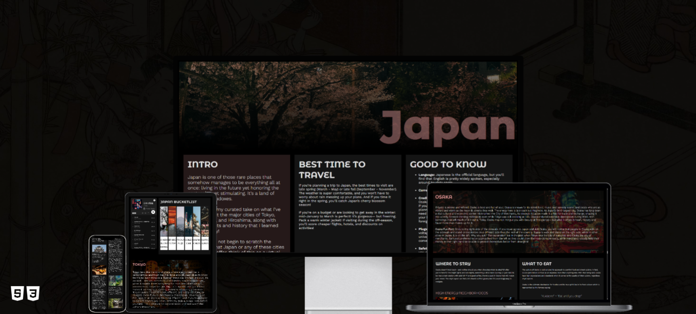
This project is a fully responsive web-based travel guide exploring four major Japanese cities—Tokyo, Kyoto, Osaka, and Hiroshima—as well as notable areas surrounding each. The site includes curated content on local attractions, regional cuisine, accommodation options, and recommended short trips from each city. Designed entirely with HTML and advanced CSS, the guide emphasizes clean layout, mobile-first responsiveness, and accessibility across a range of devices.
The main objective was to strengthen my responsive design capabilities by building a dynamic, content-rich website from scratch using only HTML and CSS. The project served as a hands-on opportunity to apply sophisticated responsive design techniques, improve my understanding of mobile-first design, and create a polished, user-friendly site without relying on third-party libraries or JavaScript.
For the UI and design of my Japan Travel Guide project, I deliberately stepped outside of my typical design approach to challenge myself both creatively and technically. One of my key goals was to fully utilize the entire width of the viewport, moving away from traditional centered or boxed layouts. By embracing edge-to-edge sections, I created a more immersive and modern user experience, especially on larger screens. I used CSS Grid and Flexbox to maintain structure and readability, ensuring the content stayed clean and organized across all devices. I also chose to design with a dark color scheme—an intentional departure from my usual preference for light, minimal aesthetics. This decision pushed me to think differently about contrast, balance, and tone. The darker background allowed vibrant images and lighter text to stand out with clarity, giving the site a sleek and contemporary feel while preserving accessibility. Typography was another core focus of the design. I paired two Google Fonts: Montserrat Alternates for titles and headings, using varying weights to create visual hierarchy, and Work Sans for body content, offering strong readability and a neutral complement to the more stylized headers. All of these design elements were built with responsiveness in mind. Through carefully structured media queries, I adapted the layout, typography, and spacing for different screen sizes to ensure a seamless and user-friendly experience across desktop, tablet, and mobile devices.
Aa Bb Cc 123
Aa Bb Cc 123
The Japan Travel Guide was developed as a final project for a web development course focused on responsive design and advanced CSS techniques. Rather than using frameworks like Bootstrap or scripting languages like JavaScript, I challenged myself to build a robust and visually engaging site using only core web technologies. The project demonstrates my ability to structure complex content, apply advanced layout methods (such as CSS Grid and Flexbox), and maintain consistent styling across different screen sizes.